How to Increase Website Conversions: Proven Tactics
Learn how to increase website conversions with proven tactics that drive more sign-ups and sales. Actionable tips you can implement today.
If you want to boost your website's conversions, you have to stop chasing shiny new tactics and start understanding why your users do what they do. It really all comes down to three things: clarifying your message, reducing friction, and building trust at every single touchpoint. Get these fundamentals right, and the conversions will naturally follow.
Setting the Stage for Smarter Conversion Wins
Before we jump into specific tweaks and strategies, we need to lay a solid foundation. Too many marketers get obsessed with hitting some arbitrary "good" conversion rate without really knowing what that number means for their business.
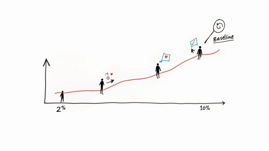
The truth is, there's no magic number that works for everyone. A 2% conversion rate could be a massive win for a company selling high-ticket B2B software, but it might be a red flag for an e-commerce store selling low-cost items. Context is everything.
Globally, the average e-commerce conversion rate floats around 2.58%. But that number swings wildly depending on the industry. For instance, arts and crafts websites often see rates closer to 4.6%, while fashion sites might only average 1.7%. The takeaway here is to set a realistic benchmark for your website, not someone else's.
To give you a clearer picture, let's break down the core concepts that underpin any successful CRO strategy. These are the pillars you'll build upon as you start testing and refining your approach.
Key Pillars of Conversion Rate Optimization
| Pillar | Description | Example Tactic | | :--- | :--- | :--- | | Clarity | Ensuring your value proposition is instantly understood. Visitors shouldn't have to guess what you do or why it matters to them. | A clear, benefit-driven headline above the fold. | | Friction Reduction | Making it as easy as possible for users to complete their desired action. This means removing unnecessary steps, fields, or distractions. | Offering guest checkout instead of forcing account creation. | | Trust Building | Giving users the confidence they need to convert. This involves showcasing social proof, security badges, and transparent policies. | Displaying customer testimonials and reviews prominently. | | Urgency/Scarcity | Motivating users to act now rather than later. This taps into the natural fear of missing out (FOMO). | Using a countdown timer for a limited-time offer. |
These pillars aren't just theories; they are the practical building blocks for creating a high-performing website. Focus your efforts here, and you'll be addressing the root causes of poor conversion, not just the symptoms.
Understanding Your Starting Point
You can't effectively increase your conversions if you don't know where you're starting from. This baseline is your North Star—it lets you measure the real impact of every single change you make. Without it, you're just throwing things at the wall and hoping something sticks.
First things first, dive into your analytics and get answers to these questions:
- What's my current overall conversion rate? This is your main KPI.
- Which pages convert the best and the worst? This tells you where your strengths and weaknesses are.
- Where are people dropping off the most? Pinpointing these friction points shows you exactly where to focus first.
Your goal isn't just to make changes; it's to make informed, data-driven decisions. A clear baseline turns optimization from a game of chance into a strategic process with measurable outcomes.
The Psychology Behind the Click
At its core, conversion rate optimization is just applied psychology. Every click, sign-up, or purchase is driven by fundamental human motivations, fears, and desires. Grasping this is the key to creating experiences that naturally guide users toward taking action. For a great deep dive into this, check out these effective conversion optimization tips that break down how to turn visitors into loyal customers.
Put yourself in the user's shoes. Are they here for a quick answer, to compare their options, or just to browse? Your website has to meet them where they are.
For example, using a trigger like a countdown timer for a special offer taps directly into the fear of missing out (FOMO). You can learn more about exactly https://www.countdown-timer.app/blog/facebook-countdown/how-to-make-timers and similar urgency elements in our detailed guide. This isn't about being manipulative; it's about aligning your offer with the user's natural decision-making process to create a smooth, persuasive journey.
Fixing Technical Glitches That Kill Conversions
You can have the most persuasive copy and a killer offer, but if your site is slow, buggy, or broken, you've already lost the sale. Nothing makes a potential customer click away faster than a page that won’t load or a button that doesn’t work. These technical hiccups are the silent conversion killers, chipping away at user trust with every second of delay.
A slow website is like a shop with a sticky front door. A few people might jiggle the handle, but most will just give up and walk over to your competitor next door. It’s an instant sign that you don't have your act together.
The data on this is brutal. Your site's loading speed is directly tied to your bottom line. Websites that load in just one second have conversion rates three times higher than sites that take five seconds to appear. For e-commerce stores, the difference is even starker—a one-second load time can lead to conversion rates 2.5 times greater than the competition.
That's why fixing your site's performance isn't just an IT problem. It's a core marketing function.
How Fast Is Your Website, Really?
Before you can start fixing things, you need a clear diagnosis of what’s slowing you down. Luckily, you don’t need to be a developer to figure this out.
The best place to start is Google's PageSpeed Insights. It's free, and it's what Google itself uses to judge your site. Just plug in your URL, and you’ll get a performance score for both mobile and desktop, along with a list of exactly what’s holding you back.
It will point out common culprits like:
- Oversized Images: This is the #1 offender. Huge, uncompressed images can grind your site to a halt.
- Render-Blocking Resources: Code (like CSS or JavaScript) that forces your visitor to wait for it to load before they can see anything on the page.
- Slow Server Response Times: An issue with your web host that means it's taking too long to even start sending your website's files.
Don't let the technical jargon scare you. The tool breaks down what each issue means and gives you a clear roadmap to fix it.
High-Impact Fixes for a Faster Site
Once you know what the problems are, it's time to get to work. Focusing on just a few key areas can make a massive difference in your site speed and, by extension, your conversion rates.
Your website's speed is a direct reflection of your respect for the user's time. A fast, seamless experience shows customers you value them, building the subconscious trust needed to make a purchase.
Start with the low-hanging fruit: your images. You can often slash image file sizes by 50-70% without any noticeable drop in quality. Use a plugin or a free online tool to compress them. It's the biggest win you'll get with the least amount of effort.
Next, set up browser caching. This tells a visitor's browser to save parts of your website (like your logo and other common files) on their device. When they come back, the site loads almost instantly because it doesn't have to re-download everything. It's a simple trick that makes a huge difference for repeat visitors.
Finally, think about how dynamic elements affect performance. For example, if you're running a flash sale, you need to make sure your on-page timer loads quickly and doesn't drag the rest of the page down with it. It’s important to know how to properly embed a countdown timer in your website so it helps, not hurts, your conversion goals.
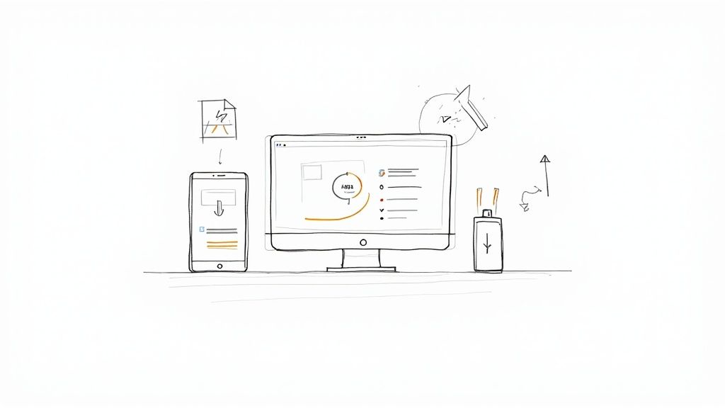
Don't Forget the Mobile Experience
These days, optimizing for desktop and treating mobile as an afterthought is a surefire way to fail. The majority of your traffic is likely coming from smartphones, and a clunky mobile site is a guaranteed conversion-killer.
This is about more than just a "responsive" design that shrinks to fit a smaller screen. It means making sure buttons are big enough for thumbs to tap, forms are a breeze to fill out, and key info is front and center without a lot of pinching and zooming.
The best way to test this? Do it yourself. Grab your phone and go through your entire sales process, from the landing page to the thank-you screen. Every single moment of friction you feel is a reason for someone else to give up and leave. Fixing these mobile-specific pain points isn't optional anymore—it's essential.
Writing Words That Actually Sell
Think of the copy on your website as your best salesperson—the one who never sleeps. It’s more than just text filling the space between photos; it's the engine that drives conversions. Great copy doesn't just list what you're selling. It taps into a visitor's real problems, shows them a better way, and makes clicking that "buy" button feel like the most natural next step. If you can get this right, you're already halfway to boosting your conversion rate.
First things first: stop talking about yourself. Nobody cares about your product's specs until they know what it does for them. It's the classic features vs. benefits argument, and it's amazing how many people still get it wrong.
Telling someone your drill has a "lithium-ion battery" is a feature. Telling them they can "drill for hours on a single charge, finishing that big weekend project without stopping" is a benefit. One is a fact; the other solves a massive frustration. See the difference?
Before you even think about writing, ask yourself one simple question: How does this make my customer's life better? The answer to that is where you'll find your most powerful sales message.
Crafting Headlines That Actually Stop the Scroll
Let's be blunt: your headline has about three seconds to do its job. If it doesn't immediately grab someone's attention and convince them to keep reading, nothing else on the page matters. All that work you put into the design and copy? Wasted.
A powerful headline needs to be specific, promise a clear benefit, and spark just enough curiosity to pull the reader in. Vague fluff like "High-Quality Solutions" is a complete waste of digital ink. It's forgettable and tells the visitor nothing.
Instead, get right to the point with something like, "Flawless Team Collaboration in Under 5 Minutes." Now that solves a problem.
Here are a few classic formulas that just plain work:
- The "How-To": "How to Get [Desired Result] Without [Common Pain Point]"
- The Question: "Are You Making These [Common Mistake] Mistakes?"
- The Direct Benefit: "The Easiest Way to [Achieve a Goal]"
Don't just copy and paste these. Use them as a starting point and twist them to fit who you're talking to. What works for a B2B software company is going to sound ridiculous for a new fashion brand.
The job of your headline is to sell the first sentence. The job of the first sentence is to sell the second sentence. Every single word has one purpose: get the reader to the next line.
Writing Descriptions That Connect and Compel
Okay, your headline worked. They're still here. Now your product or service descriptions need to deliver on that initial promise. This is your chance to connect the dots between what your product is and the value it delivers.
I've always found the Feature-Benefit-Feeling model to be a simple but incredibly effective way to structure this.
- Feature: Start with a specific product attribute. (e.g., "Our backpack is made from 100% waterproof nylon.")
- Benefit: Translate that feature into a practical advantage. (e.g., "This means all your gear stays bone-dry, even in a downpour.")
- Feeling: Paint a picture of the emotional payoff. (e.g., "So you can hike with total confidence, knowing your expensive camera and laptop are safe.")
This little trick transforms a boring spec sheet into a story. You're no longer just selling a backpack; you're selling peace of mind on a rainy day.
Designing Calls to Action That Get Clicked
Your Call-to-Action (CTA) is the final handshake. It's the moment you ask for the sale. A weak CTA can undo all the great work you've done up to this point. Generic, lazy buttons like "Submit" or "Click Here" are conversion killers. They're boring and create a moment of hesitation. What am I submitting? Where am I clicking to?
A great CTA uses strong, action-focused language that tells the user exactly what's about to happen. A good rule of thumb is to have the button text complete the sentence, "I want to..."
- Instead of "Buy," try "Get My Pro Plan Now"
- Instead of "Download," use "Send Me the Free Guide"
- Instead of "Sign Up," consider "Create My Account"
The text on your CTA button should feel like the natural conclusion to the conversation you've been having on the page. When you line everything up—from the headline to the final click—you create a smooth, persuasive path that leads straight to a conversion.
Earning Trust With Social Proof and Guarantees
When someone new lands on your website, they're subconsciously asking one simple question: "Can I trust this place?" In a sea of options, your product and copy can get you part of the way, but it's that instant hit of credibility that really closes the deal.
This is where social proof and solid guarantees become your best friends. They work by answering that trust question with a resounding "Yes!" before the doubt even creeps in. Seeing that real people have bought from you—and loved the experience—is a game-changer. It shifts the dynamic from a company pushing a product to a person making a smart, validated decision.
This infographic breaks down a few of the core pieces that build that trust and drive sales through smart messaging.
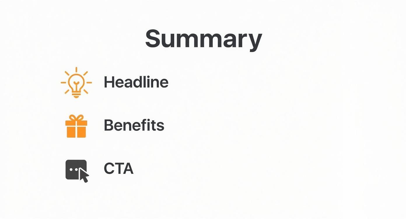
It’s all about how a punchy headline, benefit-driven copy, and a clear call-to-action team up to create a journey that feels both persuasive and secure.
Let Your Customers Do the Talking
Honestly, the most powerful way to build this trust is to step back and let your customers speak for you. An authentic testimonial is worth more than any marketing slogan you could ever dream up. It’s unbiased, third-party proof that you actually deliver on your promises.
Here are a few ways I’ve seen this work wonders:
- Quote Testimonials: Sprinkle short, punchy quotes from happy customers across your site. Think homepage, product pages, and even right in the checkout flow.
- Case Studies: Got a more complex B2B service? Nothing sells it better than a detailed case study. It’s a full-blown transformation story, showing the "before" and "after" for a real client.
- Video Reviews: It doesn't get more real than a customer on camera. Video feels genuine, is harder to fake, and instantly builds a connection.
If you need a hand gathering and displaying all that customer love, check out tools like GoodKudos for testimonials and social proof. They make the whole process much smoother.
Don't Underestimate Trust Badges
Beyond direct customer quotes, small visual cues can do a lot of heavy lifting to calm an anxious visitor. Think of them as trust shortcuts—tiny but mighty elements that signal security and legitimacy at a glance.
Your goal is to remove every ounce of doubt from the customer's mind. A well-placed trust seal or a money-back guarantee can be the final nudge a hesitant buyer needs to feel secure enough to click "Complete Purchase."
You'll want to place these strategically, especially near conversion hotspots like "Add to Cart" buttons or payment forms:
- Security Seals: Logos from well-known providers like Norton or McAfee show your site is locked down for transactions.
- Payment Logos: Displaying familiar icons like Visa, Mastercard, and PayPal makes your checkout feel standard and safe.
- "As Seen On" Banners: If you've been featured in the media, flaunt it! Showing logos from reputable publications lends you instant credibility by association.
Different forms of social proof work better for different goals. This table breaks down some common tactics to help you decide which is right for you.
Social Proof Tactics Comparison
| Social Proof Type | Best For | Implementation Tip | | :--- | :--- | :--- | | Customer Testimonials | Building product-specific trust | Place quotes directly on product pages near the "Add to Cart" button. | | Case Studies | High-ticket services or B2B | Structure it as a story: problem, solution, and quantifiable results. | | "As Seen On" Logos | Establishing brand authority | Feature these on your homepage or "About Us" page to build immediate credibility. | | Real-Time Notifications | Creating urgency and FOMO | Use pop-ups like "Jane from NY just bought..." but use them sparingly to avoid annoyance. | | User-Generated Content | Showing the product in real life | Create a branded hashtag and encourage customers to share photos on social media. |
Choosing the right mix depends on your audience and what you're selling. For e-commerce, user-generated content is gold. For a SaaS company, a powerful case study might be your best bet.
Eliminate Risk With a Rock-Solid Guarantee
The final piece of the trust puzzle? Taking the risk off the table. Every purchase, whether it's $10 or $1,000, comes with a little voice in the customer's head asking, "What if this doesn't work out?" A strong guarantee silences that voice.
A "30-Day Money-Back Guarantee" isn't just a policy—it's a statement of confidence. You're telling the customer, "We are so sure you will love this that we are willing to take on all the risk." This simple promise can dramatically boost conversions by getting rid of that fear of financial loss.
Just make sure your guarantee isn't buried in some obscure FAQ page. Shout it from the rooftops! Feature it proudly on your product pages and during checkout. The safer you make your customers feel, the more likely they are to buy.
Bringing Customers Back With Email and Retargeting
Let's face a hard truth: most people who visit your website aren't going to buy anything on their first trip. It's just the nature of the game. They might be doing research, comparing you to a competitor, or maybe their cat just jumped on the keyboard.
This is exactly where a smart follow-up strategy becomes your secret weapon. Instead of hoping for a one-shot conversion, you need a system to recapture that attention and keep the conversation going.
That system is built on two pillars that work beautifully together: email marketing and retargeting ads. They create a gentle, persistent presence that keeps your brand fresh in a potential customer's mind, nudging them back to your site when the time is right. It's how you turn a fleeting visit into a real relationship.
Nurturing Leads With Automated Email Sequences
Don't ever let anyone tell you email is dead. It's a conversion machine. Email still boasts one of the highest conversion rates out there, hovering around 10.3%, which crushes most other traffic sources. The ROI is even better, generating between $36 to $40 for every single dollar you spend. You can dig into the full conversion rate data on Convertcart.com to see these industry benchmarks for yourself.
The trick is to stop thinking in terms of one-off promotional blasts and start thinking about automation.
-
The Welcome Series: This is your digital handshake. When someone subscribes, a sequence of 3-5 automated emails can introduce your brand story, highlight your best stuff, and maybe even offer a little something to get them to make that first purchase.
-
Abandoned Cart Reminders: A mind-boggling 70% of online shopping carts are left behind. You can rescue a huge chunk of that lost revenue with a simple automated email. The first one can be a friendly reminder, followed by another that might offer a small discount or showcase some five-star reviews to build trust.
Your email list is one of the only marketing assets you truly own. It's a direct line to your most engaged audience, and building a thoughtful, automated communication strategy is one of the highest-leverage activities you can undertake to boost conversions.
By setting up these sequences, you're building a system that works for you 24/7, turning missed opportunities into sales without you having to lift a finger.
Recovering Sales With Smart Retargeting Ads
Okay, so email is fantastic for people who've already given you their address. But what about the huge majority who visit and vanish without a trace? That's where retargeting comes into play.
By placing a small piece of code (often called a "pixel") on your website, you can show targeted ads to your past visitors as they scroll through other sites and social media feeds like Facebook and Instagram.
This works so well because you're talking to a warm audience—people who already know who you are. You’re not a random interruption; you’re a familiar face reminding them why they stopped by in the first place.
Here are a few powerful retargeting campaigns you can run:
- General Site Visitors: Show ads to anyone who has visited your site in the last 30 days. These can be simple brand-awareness ads or showcase your best-selling products.
- Product Page Viewers: Get super specific by targeting users who looked at a certain product but never added it to their cart. Your ad can feature the exact product they were considering. It’s personal and incredibly effective.
- Cart Abandoners: This is your most valuable group. Show them ads with the very items they left in their cart, sometimes with a special offer to seal the deal.
For big sales events, combining retargeting with a sense of urgency is a classic move. For example, you could run a Facebook ad with a live countdown timer that's only shown to people who visited your Black Friday landing page. We dive deeper into these kinds of campaigns in our guide to effective Black Friday marketing strategies.
When you segment your audience like this, your advertising stops feeling generic and becomes a helpful, timely nudge that gets people to act.
Your Top Questions About Boosting Conversions
As you start putting these conversion strategies into practice, you're bound to run into a few questions. This is where the rubber meets the road, and getting a handle on these common sticking points can make all the difference.
Let's walk through some of the most frequent questions I hear from marketers and business owners trying to figure out how to really move the needle on their website conversions.
How Long Does It Really Take to See an Increase in Conversions?
This is the big one, isn't it? And the honest, no-fluff answer is: it completely depends. The timeline for seeing a real lift in your conversion rate hinges on what you change and how much traffic your site gets.
Simple tweaks on a high-traffic page—like rewriting a confusing headline or just changing a CTA button from blue to orange—can give you a statistically significant A/B test result in a matter of days. When you have that much data coming in, you can learn and iterate incredibly fast.
On the flip side, bigger projects are a different story. A full homepage redesign or a major overhaul to your site speed might take weeks just to get live. From there, you'll need at least a few more weeks to collect enough data to know for sure if your big swing was a home run or a strikeout.
The goal isn't just speed; it's momentum. Knock out the high-impact, low-effort changes first to score some quick wins. Use the data and the confidence from those wins to fuel your bigger, longer-term optimization projects. That's how you build sustainable growth.
What’s the Single Most Important Thing for Conversion Rate Optimization?
If I had to boil it all down to one thing, it's this: a deep, almost obsessive understanding of your user. Every single tactic we've talked about, from the techy fixes to the persuasive copy, is just an attempt to better serve the person on the other side of the screen.
You could have the fastest, most beautiful website in the world, but it will still fall flat if it doesn't solve your user's problem or speak their language. Every optimization effort has to be grounded in answering their questions, soothing their anxieties, and helping them reach their goals.
That's why you should pour your time and resources into things like:
- User Research: Actually talk to your customers! Run surveys and interviews to hear about their pain points in their own words.
- Behavior Analysis: Use tools like heatmaps and session recordings to see exactly where people are getting stuck or confused on your site.
- Customer Feedback: Actively dig through reviews, support tickets, and comments. This stuff is pure gold.
This relentless focus on the user is the bedrock of effective CRO. Without it, you’re just throwing spaghetti at the wall and hoping something sticks.
How Much Should I Actually Budget for CRO?
Your CRO budget can be as scrappy or as robust as you need it to be. The great news is that you can make serious headway with very little money, especially when you're just getting started.
If you're bootstrapping it, your biggest investment will be your time. You can get incredibly far with a handful of powerful free tools:
- Google Analytics: Your source of truth for tracking conversion metrics and spotting leaky pages.
- Hotjar (Free Plan): Get access to heatmaps and session recordings to see what your users actually do.
- Google Optimize: A free and powerful tool for running A/B tests to validate your ideas.
Once your efforts start paying off and you can show a clear return, then you can scale up. A bigger budget might mean investing in premium analytics software, hiring a pro copywriter, or bringing on a specialized CRO agency. The smart play is to start small, prove the value, and then reinvest your gains back into a more sophisticated optimization program.
Ready to create that crucial sense of urgency for your next big launch or sale? With Countdown Timer App, you can easily build and publish auto-updating countdowns for your Facebook page or website, keeping your audience engaged and ready to act. Create your free timer today.